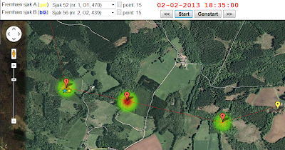
This week I have been busy trying to visualize the race data available from the Danish scout adventure race "Alligatorløbet" 2013. This year they made the race tracking data available online as an Excel file with check-in and check-out times for each team on each checkpoint. What I have done is to animate that information as a little interactive movie that displays team-at-checkpoint intensity as heat maps on Google map.
It is rather neat, if you ask me, but check it out yourself: http://www.elfisk.dk/allitrack/CheckpointAnimation.html.

It is implemented like this:
- All data is normalized to CSV files with one record for each team/checkpoint/arrival-time/departure-time registration.
- The CSV files are read by a C# program that transforms it to a Javascript file to be included on the page. This file contains the checkpoint intensity for each time frame sample (5 minutes) along with team names and team scores.
- The HTML page loads Google maps and overlays it with a KML file that shows the checkpoints. This KML file was created in Google Earth.
- Then the Javascript animation kicks in and updates the heat maps every half second. It also constantly updates the position of the two teams you want to follow during the race.
- Add to this some event handlers for interacting with the buttons and you are done :-)
Have fun.